If it ain’t broke, break it.
That seems to be the Cracker Barrel motto. The restaurant announced a new creative campaign Aug. 18, including a new logo, debuting “a refreshed look and feel” that “positions the iconic American brand for the future.” (RELATED: REPORT: Bud Light Sales Still In Free Fall As Other Anheuser-Busch Beers Are Beginning To Feel The Sting)
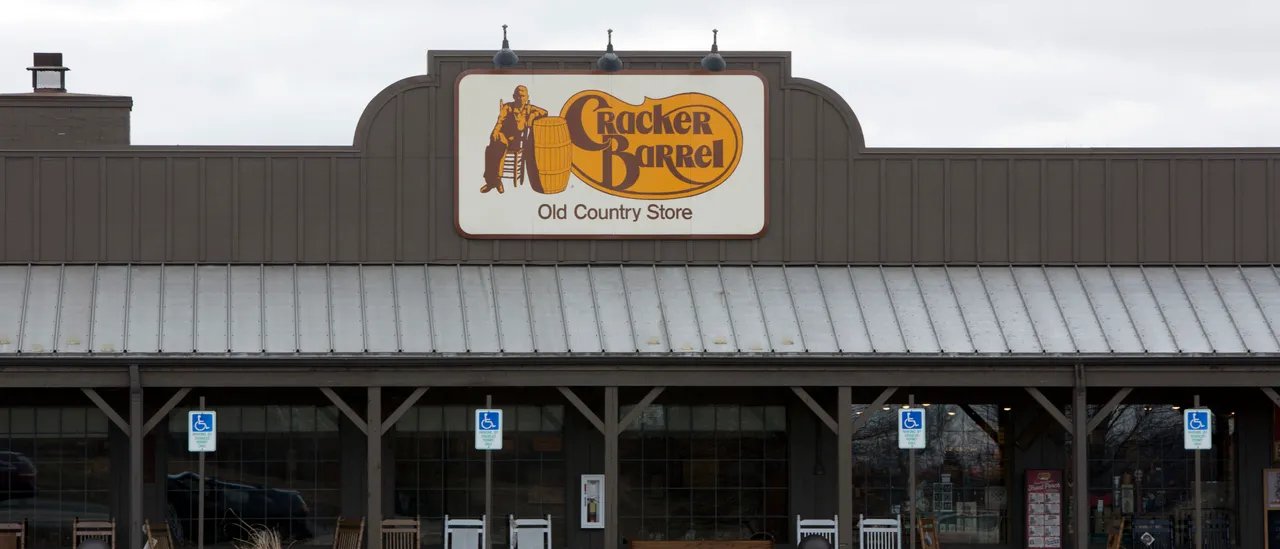
If this is the future, it’s really boring. Gone, from the logo, is the man reclining in a chair. Gone, too, is the barrel. Forget about crackers.
The new logo simply reads, “Cracker Barrel,” parked in a soft, six-sided shape. It features no illustrations. The typeface is slightly sleeker.
NEW: Cracker Barrel reveals new logo, CEO Julie Felss Masino says people love their new rebrand.
“Honestly, the feedback’s been overwhelmingly positive that people like what we’re doing,” Masino told GMA while discussing the overall rebrand.
This logo is depressing. pic.twitter.com/EZVpWLv4Bg
— Collin Rugg (@CollinRugg) August 20, 2025
“Farm fresh scrambled eggs and buttermilk biscuits even serve as inspiration” behind the logo’s color palette, according to the brand.
Just how much marketing Kool-Aid did the Cracker Barrel team down before writing that?
A logo should tell you something about a brand. The old Cracker Barrel logo says, “Cheesy and country-western.” Cracker Barrel is cheesy and country-western. Their new logo says, “We threw a bunch of corporate art into a blender.”
Cracker Barrel isn’t alone in this approach.
MSNBC will soon be My Source News Opinion World (MS NOW). As if that changes anything.
Car company Jaguar ditched the jaguar and adopted an annoyingly round typeface. That’s the least of the company’s marketing misfires, in fairness, but it’s still pretty bad. The old logo connotes sleekness, speed, luxury. The new logo could belong to a language learning app. Or a wildlife education program for kids. (RELATED: Jaguar’s New Car Design Fully Deserves Bud Light Treatment)
Did MSNBC hire the Jaguar team for their rebrand? pic.twitter.com/KSrpHF1OAG
— Kevin Dalton (@TheKevinDalton) August 18, 2025
Other companies have elected to take the vowels out of their logos. What does “LMND” sell? No, not lemonade, but clothing.
“LMND” is not to be confused with “LMNT,” which sells zero sugar electrolytes. Get it? Element? Maybe they’re hoping the extra brain power exerted in solving that puzzle will exhaust customers into reaching for a drink.
Clutter could be making a comeback, if not among marketing executives. Op-eds defending clutter ran in Architectural Digest and The New York Times a few years ago. Both reference “cluttercore,” a Gen Z coinage for a cluttered household aesthetic.
Cracker Barrel is not sophisticated. Not every restaurant needs to be. Their logo, in turn, should evoke what they do best: Plying tired roadtrippers with calorically monstrous helpings of fried things.
Follow Natalie Sandoval on X: @NatSandovalDC


![Florida Man With Violent History Arrested for Choking a Cop [WATCH]](https://www.right2024.com/wp-content/uploads/2025/06/Eleven-Stabbed-in-Attack-at-Salem-Homeless-Shelter-Across-From-350x250.jpg)