
This reminds us of 2024, when Minnesota got rid of its old, racist flag and replaced it with one that looks a lot like the flag of Somalia. Yes, the AP reported the new flag was “non-racist.”
Things to know about Minnesota’s new, non-racist state flag and seal https://t.co/eGZGLThgB2
— The Associated Press (@AP) January 3, 2024
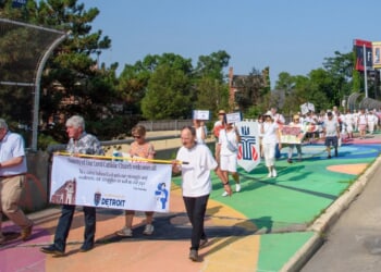
We can see why the City of Austin’s old logo was problematic: it featured a cross in front of what appears to be an eagle’s spread wings. Fortunately, the residents of the city, whose unofficial motto is “Keep Austin Weird,” are getting a new logo, thanks to a $1.1 million makeover. See what you think:
No, this is not satire. This is a real video of the city of Austin proudly unveiling a $1.1 million rebrand. pic.twitter.com/ipCL5DTn32
— End Wokeness (@EndWokeness) September 5, 2025
Our thanks to CyberMan for explaining the old crest:
So in other words; Austin retired their crest — for a letter? The original crest and its meanings:
•Shield and Colors: Red, white, and blue sections symbolizing Texas and U.S. identity.
•Oil Lamp: Yellow lamp on blue triangle, representing education and knowledge.
•Cross… pic.twitter.com/lthmoiCybL
— CyberMan (@thalerz) September 5, 2025
The post continues:
… •Cross and Wings: White bird with yellow cross, honoring Stephen F. Austin and peace.
•Text “CITY OF AUSTIN”: Arched top text identifying the city.
•Text “FOUNDED 1839”: Arched bottom text marking the founding year.
•Yellow Border: Outline framing the shield, suggesting prosperity.
•White Circle with Blue Dots: Outer frame adding formal design.
With the homeless issues they should have gone in this direction pic.twitter.com/Z0mnUYVwtw
— Danielle Fountain – Austin Realtor (@The_One_Realty) September 5, 2025
Recommended
This editor can’t look at it and not read it as “Autism.”
What money laundering looks like: pic.twitter.com/jcV9wUhmMa
— Emilia Henderson (@Emilia__writes) September 5, 2025
It’s so bad I’d swear I read autism before i realized it said Austin, seriously it looks like a big pharma drug logo not the city crest, which is what the original was.
— Big Hoss 🚛💨🗽🇺🇸 ✝️ (@bucfanjoe) September 5, 2025
This branding is absurd.
— Autism Capital 🧩 (@AutismCapital) September 5, 2025
This is ridiculous. Austin has so many other much more important problems.
— Paul A. Szypula 🇺🇸 (@Bubblebathgirl) September 5, 2025
Worse than Cracker Barrel
— Peter B (@realpeteyb123) September 5, 2025
Fixed it pic.twitter.com/TWtZ6WJw6M
— 𝕮𝖆𝖑𝖎𝖈𝖔 𝕵𝖆𝖈k 🇺🇸 (@CalicoTheJack) September 5, 2025
So, who really got $1.1 million dollars.
Anyone could have created that logo in 5 minutes for free. Let alone $1.1 million.
— J (@JayTC53) September 5, 2025
— CTXNews (@CTXNews) September 1, 2025
— Natalia Soria (@natysh16) September 5, 2025
One of the reasons Austin and other places are getting rid of crests, seals, and coats of arms is because they represent Western civilization and the left, of course, wants to erase as much of it as it can.
— Frankie D (@FrankieInVegas) September 5, 2025
Rebranding is all money laundering because no organization ever does the work in-house, but hires (their friends) “contractors” to do the “studies and design.” Once their friends gets rich off this, they favor-launder the kickbacks, so that the fraud is never detected.
— Mel C. Thompson (@MelCThompsonNow) September 5, 2025
This is so painfully moronic. What a massive, shameful downgrade. An insult to history, and to all those who built that legendary Texas city. Bring back the beautiful coat of arms and ask for forgiveness before the cross that tops it.
— Billy Prothero (@monteverdix) September 5, 2025
I like Grok’s better for free pic.twitter.com/yUQNQUnlN3
— Chane Wheels (@ChaneWheels17) September 5, 2025
If the smell of a doctor’s office had a look, this would be it.
— Doku HL SD (@Doku_HL_SD) September 5, 2025
Looks like a hospital logo for an Autism Treatment center.
— L. P. Olsen 🇩🇰🇺🇸 (@CallElvisAgain) September 5, 2025
It looks like a failing health insurance company
— JJWIII (@TophatAmphibian) September 5, 2025
So what you’re telling me is, someone did a $100,000 rebrand, and the rebranding committee got paid $1 million dollars to be there 💀💀💀
— Chaotic Good (@ChaoticGood42_) September 5, 2025
Exactly.


![Gavin Newsom Threatens to 'Punch These Sons of B*thces in the Mouth' [WATCH]](https://www.right2024.com/wp-content/uploads/2025/08/Gavin-Newsom-Threatens-to-Punch-These-Sons-of-Bthces-in-350x250.jpg)
![ICE Arrests Illegal Alien Influencer During Her Livestream in Los Angeles: ‘You Bet We Did’ [WATCH]](https://www.right2024.com/wp-content/uploads/2025/08/ICE-Arrests-Illegal-Alien-Influencer-During-Her-Livestream-in-Los-350x250.jpg)

![Black BET Billionaire Donor Stuns Democrats, Gives $500K to Winsome Earle-Sears [WATCH]](https://www.right2024.com/wp-content/uploads/2025/08/Black-BET-Billionaire-Donor-Stuns-Democrats-Gives-500K-to-Winsome-350x250.jpg)